Wednesday, 27 April 2011

looking back at your preliminary task, what do you feel you have learnt in the progression from it to the full product


From this task i have developed my skills in technical areas such as Photoshop and Indesign to create a professional finish to my work. I have also learnt that the audience plays a big part in the choices we make in constructing our magazines, it all depends on there choice of genre and there age. For the preliminary task i definitely didn’t carry out as much research or put as much thought into it as i did with my main task and i learnt this is key in producing an accurate production.

I put more planning into the layout, images used, and colours on my main task as i wanted to achieve more marks that i did on my other work. i sketched out a plan for my front cover so i knew what i was going to do when i got onto Indesign.

Other research i carried out was on two other magazine 'the rolling stone' and 'nme'. I took notice of what fonts, colours and images they used so i could take it into consideration for my magazine so it looked more realistic.

I do feel i have made a vast improvement from my preliminary task to my main one i feel i could have included more mastheads on my front cover. i also believe, that if i had enough time, i could layout my contents page in a much better way to gain more marks. As my magazine is aimed at both sex's i could have used more unisex images as i only included images of a female. However, overall i believe my unisex indi music magazine was quite a success when relating to the genre and target audience
.

Thursday, 7 April 2011

How did you attract/address your audience?

I attracted and addressed my audience by using models that are roughly the same age as my target audience and who dress in a similar fashion. i did this as my target audience wouldn’t be interested in someone who is nothing like them therefore resulting in less magazine sales. They can relate more to the models i have chosen therefore persuades the reader that they to can be like them and maybe make it in the music business as easy.

I used big bold texts and bright contrasting colours to catch there attention. This makes the magazine look like something exciting to read. I made it £1.20 which is quite cheap and affordable for students and i have included competitions that they could win such as gig tickets.

Who would the audience be for your media product?


The audience for my music magazine is for both male and females aging between thirteen to twenty. They are going to be of working/middle class that are interested in Indi and alternative images.

The two images above are examples of my audience. There names are Molly Morris and Zack Bullock and they both enjoy listening to bands such as The kooks and Florence and the machine which are both typical Indi bands. They also enjoy socialising with friends and regularly attending gigs and festivals. Molly is currently studying A levels in photography media and English and is hoping to go to university when she has completed her A level studies. Zack is also doing A levels and is studying media art and maths and is also hoping to go to university. Molly and Zack both work in a shop together called the wardrobe and spend there wages on things like clothes, gig tickets, mp3 downloads and films. They both live near the centre of town which is a busy environment but enjoy this surrounding. Molly regularly shops at places like Topshop, Miss Selfridge and h & m. Zack regularly shops at places like Burton, Topman and h & m.

how does your media product represent particular social groups?

The female model on the front cover of my magazine is dressed in a nice white shirt and black trousers. She seems quite stylish and is looking straight into the camera with a serious look on her face. This gives of the impression that the way she is dressed shows she is important and respectable and her facial expression shows that she is serious. Her outfit fits in with the Indi stereo type therefore will attract the right kind of people to read this magazine.
The names of the artists on my front cover seem strange (for example vampire weekend and the kooks). This represents young artists and also that the magazine is something different and creative.

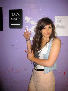
The main image i used in my feature is of my female artists pointing up in the air. She looks happy and quite kooky showing she is confident but also outgoing as she is unashamed of posing and looking into a camera. In the feature i use respectable English with no slang or swearwords to show that she is respectable female despite being a young artist.

In what ways does your media product use develop or challenge form and conventions of real media products?

My media product was a indie music magazine. As this was the theme this helped me decide on what kind of person was going to be included on the front cover. Indie kids are associated with dressing smart in shirts and tight jeans with tassely hair so this gave me the incentive to pick someone who fitted this criteria so my audience could see a comparison with other indie artists.  
All the way through my magazine i have used a colour scheme that has involved typical male and female colours such as greens, purples and oranges. i chose these sort of colours as i have noticed most music magazines such as Kerrang and Rocksound are aimed at more of a male audience and i wanted to make mine different to chose to aim it at both sex's. The fonts i have used are big and bold as this gives it more of a preppy look my audience would enjoy. Most indie magazines use bold fonts like aerial black but for my masthead on my main feature i decided to challenge indie conventions by using a more dainty font such as script ms bold to give it an unique look.

Most of my images are medium long shots which are quite common when it comes to indie magazines, expect for the three small images on my feature. i chose to conform with the indie conventions with medium long shots as this shows of the persons outfits and how they are positioning themselves but also you can clearly see there expression on there face. In my feature i have used no slang and i have spoken in English and this is how my target audience speak. if i were to use slang words it would of made my interview seem less realistic.

Monday, 4 April 2011

front cover progress

 
This is how my front cover began. i chose a light green background to make it look cheerful but not exclude either gender. I put the photo of my main feature in the centre so most attention is focused onto them. My photo is of a female model wearing a shirt and tight black trousers with a brown belt which is seen as 'trendy' to my target audience. My photo was originally on a different background but this didn’t fit in with my ideas on what i wanted the front cover to look like so i used Photoshop to cut out my model and put her on a transparent background giving me a choice on what colour background i could choose.


 This is how my front cover has progressed. I added a title, date of issue & price, bar code, and banner at the bottom. I played around with different font types and colours so see what looked the best and i felt having live in the colour yellow fitted in well as i associate live gigs with bright lights.
I positioned the title of the magazine were i have so it is easy to read however doesn't draw to much attention to it. i put the bar code where it is for the same reason. It is out the way however isn't hard to find it. The date and price of the magazine is small and in black so it doesn't stand out to much however if the reader felt it necessary to find this information out they would know were to look.
In this screen shot i have added the main title of my feature onto my front cover. i put this quite big in the middle of the page over the top of the image of my model as i have seen this done on other magazines and thought it was quite creative as was made obvious to my audience what the main story was going to be about. I put it in pink dainty writing as this story is on a female and the colour pink usually represents a girl.


This is my finished front cover. I added a competition to encourage readers to buy it more as they feel they could potentially get something for free out of buying my magazine. I used the same font as the masthead so things looked neat and not to busy. i also added a story on a different artist just to give my audience more incite as to what was going to be inside my magazine.